Overview
Originally called CATO-SMS, Allucent is a global clinical development consultant with over 30 years of experience servicing small to mid-sized Pharma companies looking for breakthrough therapeutics. After several mergers and acquisitions with different service providers, they needed a new name and brand identity to realign with their strategic goals.
The new name is based on the latin word Alluceo, meaning shining or shining a light upon something. The logo mark has a shape of a hanging lamp inside the negative space of the letter A to reinforce the meaning of the name.
I was a part of the team that designed this amazing logo and brand identity. Choosing the unique colors to stand out amongst competitors and providing insight and expertise to each part of the company’s new brand was exciting.


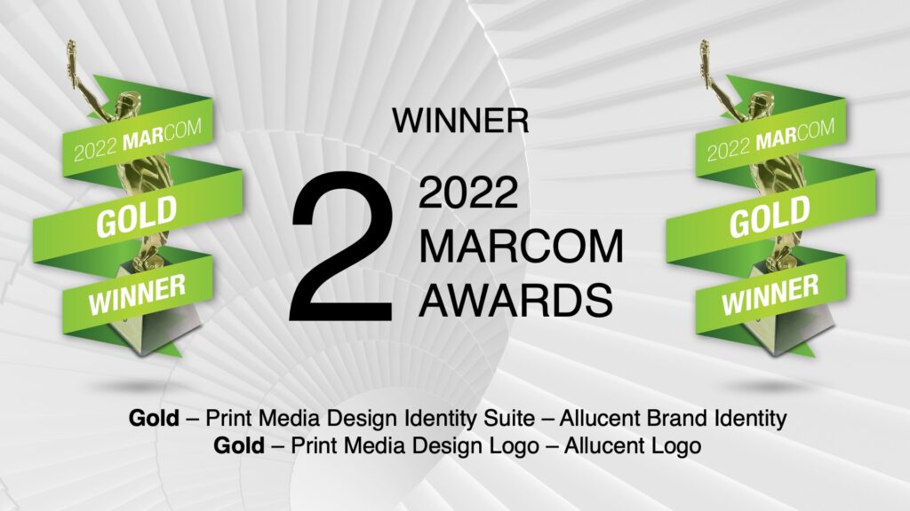
2x Marcom Award Winner
The Marcom Awards are an international creative competition that recognizes outstanding achievement by creative professionals involved in concepts, creative direction, design and production of marketing materials and programs. There were over 6,000 entries from throughout the US, Canada, and 43 other countries.
Marcom is one of the oldest, largest, and most-respected creative competitions in the world. Winners range from huge international agencies and fortune 500 companies to independent design and marketing firms.
Our designs were chosen to win the Gold Marcom Award for each the logo and brand identity.
